BunkMate: Visual Attendance Predictor
A universal web tool that helps students track their attendance and visually predict how many classes they can miss while staying above a required threshold.
The Challenge
Students often struggle to manually calculate how their attendance percentage will be affected by missing classes. They need a quick, reliable, and easy-to-understand way to gauge their standing and make informed decisions without complex mental math.
The Goal
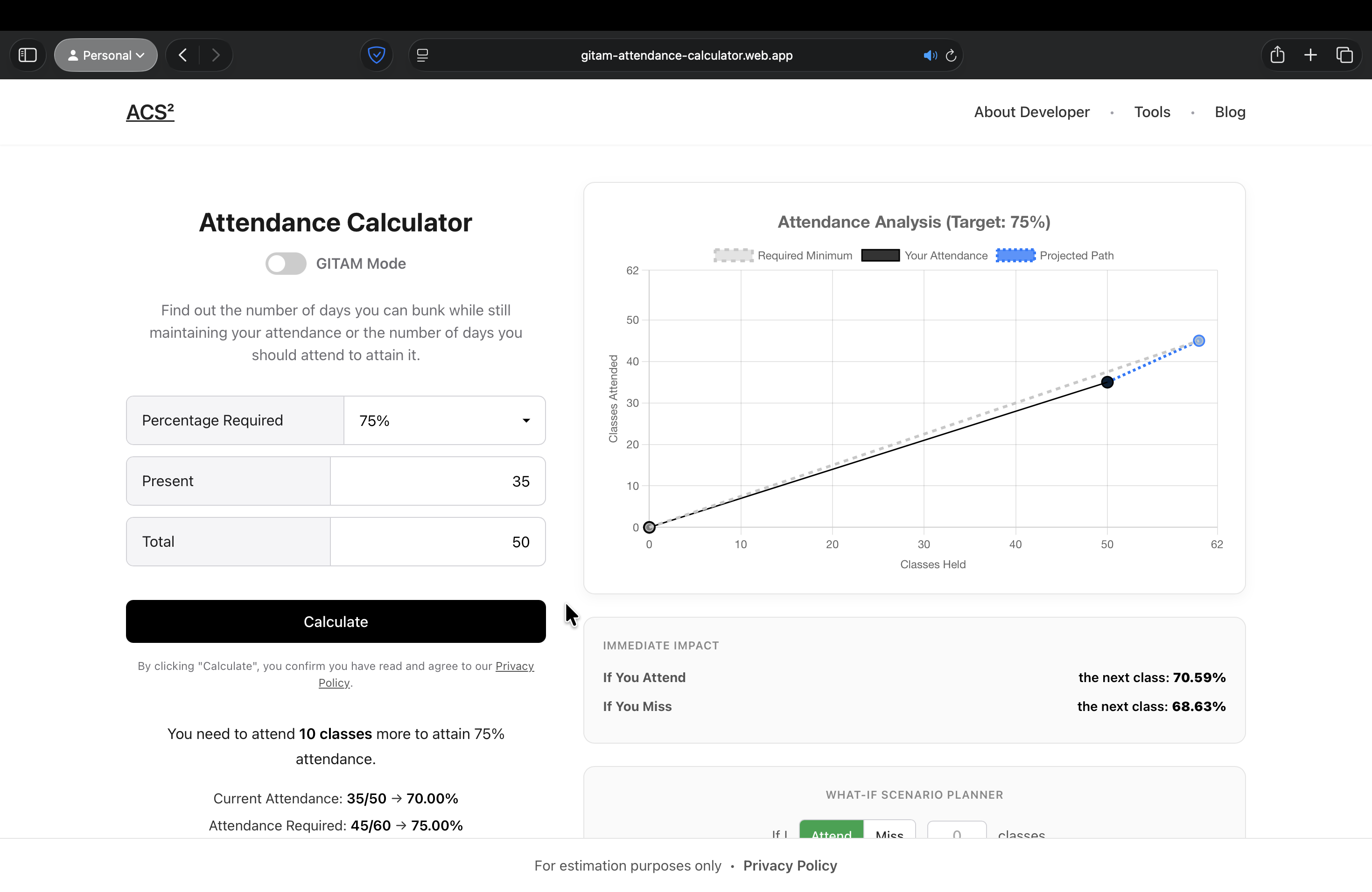
To create a simple, user-friendly, client-side web tool that takes a user's current attendance data and visually predicts their future attendance percentage, clearly answering: "How many classes can I bunk?" and "How many must I attend?".
The Approach
Discovery & Planning
I identified the core user need for a simple "what-if" attendance analysis tool. The focus was on speed and clarity, with no login or data storage required, simplifying the user flow to input, calculate, and visualize.
Design & Prototyping
I designed a clean, minimalist UI focusing on a few input fields and a prominent results display. A line graph was chosen as the most effective way to visualize the attendance trend and the impact of future actions.
Development & Technology
I built a lightweight single-page application using React.js for efficient state management. The core logic was implemented in pure JavaScript, and I integrated Chart.js to render dynamic and responsive graphs.
Key Features
Simple Data Input
Users only need to enter total classes held and classes attended (or current percentage) to get started.
Predictive Calculations
The app instantly calculates the exact number of classes a student can miss or must attend to reach a goal.
Interactive Visual Graph
A dynamic graph visually represents the user's attendance journey and the impact of future choices.
Client-Side Processing
All calculations happen instantly in the browser, ensuring a fast, private, and responsive user experience.
The Result
The application delivered an intuitive and highly practical tool for any student. Its visual nature made complex calculations easy to understand at a glance, empowering users to manage their attendance proactively and with less stress.
What I Learned
This project was a fantastic exercise in front-end development and data visualization. I learned how to translate mathematical logic into a clean UI and highlighted the power of libraries like Chart.js to make data engaging and immediately understandable.